What is user-centred design and why is it important to build human focussed empathy driven solutions into digital products?
Introduction
Modern consumers are savvy, commercially aware, selective, attention poor, and have a high level of expectation when interacting with digital interfaces. So, providing your customers with an outstanding experience is now more business critical than ever.
Gaining a competitive edge requires that you tailor your website precisely to meet consumer needs. Lead with empathy and always place your users at the heart of your decision making process.
By understanding your customers’ goals, desires, and behaviours, you can create products that provide meaningful interactions, reduce friction and effort, fulfil their needs, and exceed their expectations.
Increasing consumer experience and satisfaction has powerful consequences, ultimately leading to improved brand loyalty, revenue, retention and conversion.
“A well-designed user experience can lead to a 400% increase in a website’s conversion rate.”

What is user experience?
The term “user experience” (UX) was originally coined in 1993 by UX pioneer and Apple employee Don Norman. He understood that a product is more than just a product – it is a complex set of human experiences. In his words, “User experience encompasses all aspects of the end-user’s interaction with the company, its services, and its products.”
User experience is the foundation of any successful digital product. A good user interface (UI) in isolation is not sufficient to effectively meet the needs of its users. But when combined with empathetic UX, best practices and an understanding of the target audience’s needs and behaviours a product can truly excel at delivering for both businesses and consumers.
This said, UX and UI are not mutually exclusive and there is plenty of overlap between the two practices. UX Designers must still take layout, hierarchy, consistency, typography and more into consideration, just as a UI Designer would. Crucially, however, UX should always prioritise the needs of users and usability above aesthetics.
The importance of ‘putting users first’ is that everything your business does both starts, (and, for that matter, ends), with your users and their experiences. If you prioritise user needs, it’s possible to make more informed and more effective decisions about the future of your digital product and the effect it will have on consumers.
User experience design is about crafting solutions that solve problems for users and understanding human psychology.
“User experience design is the process design teams use to create products that provide meaningful and relevant experiences to users. This involves the design of the entire process of acquiring and integrating the product, including aspects of branding, design, usability and function.”

Why is UX important and how does it benefit business?
It’s often easy to overlook the importance of good UX, especially as there can be a perceived high degree of effort involving stakeholders in the design process. However, research unequivocally demonstrates that it can be a valuable investment and pay dividends. An experiment called ‘The UX Fund’ founded by Teehan+Lax in 2006 proved that UX-focused companies perform better financially. Businesses can build better products by investing in UX early and the potential return on investment (ROI) is huge.
Benefits of UX:
- Providing the most appropriate solution for users
- Boosting consumer engagement and retention
- Delivering a better product experience
- Increasing equity, diversity, inclusion and accessibility in your product
- Improving credibility
- Strengthening your brand image
- Increasing conversion rates and revenue
- Beating your competitors
- Improving site performance and SEO
- Reducing operating costs of development and customer support
- Improving CX and satisfaction
- Encouraging ‘word of mouth’ referrals
- Reaching your target goals faster
“Every dollar invested in UX brings, on average, 100 in return. This amounts to an ROI of over 9,900%.”

Dmitri Atrash writes in The ROI of UX Design: why user experience is an important investment: “Great UX design doesn’t happen by accident. Organisations need to make the up-front investment in good design so that they can reap the benefits, drive their business goals further and faster, and build a customer base that will love and evangelise for your product… Make the user experience core of your product, invest heavily, and take the time to make good design decisions that will drive your business or product forward for years to come.”
In The Bottom Line: Why Good UX Design Means Better Business published in Forbes, Goran Paun states: “As we conduct more and more of our daily business interactions online, it’s never been more critical to offer users a seamless, frictionless digital experience that aligns with their daily lives. Users have come to expect an optimized user experience as a basic requirement, and it’s now become a prerequisite implementation strategy across all platforms and devices.”
Ultimately an investment strategy in UX is a case of speculating to accumulate.
“88% of online shoppers say they wouldn’t return to a website after having a bad user experience.”

The 8 principles of usability
Usability is a core tenet of UX but crucially the two are distinctly different in definition, the former being a quality attribute of the UI. Usability is defined as an intersection of:
- Users: the people for whom products are created
- Goals: the goals that products should assist users in achieving
- Cases: the usage cases for which things are designed
“The degree to which a technology could be used by described users to accomplish particular goals with performance, effectiveness, and user satisfaction of usage.”

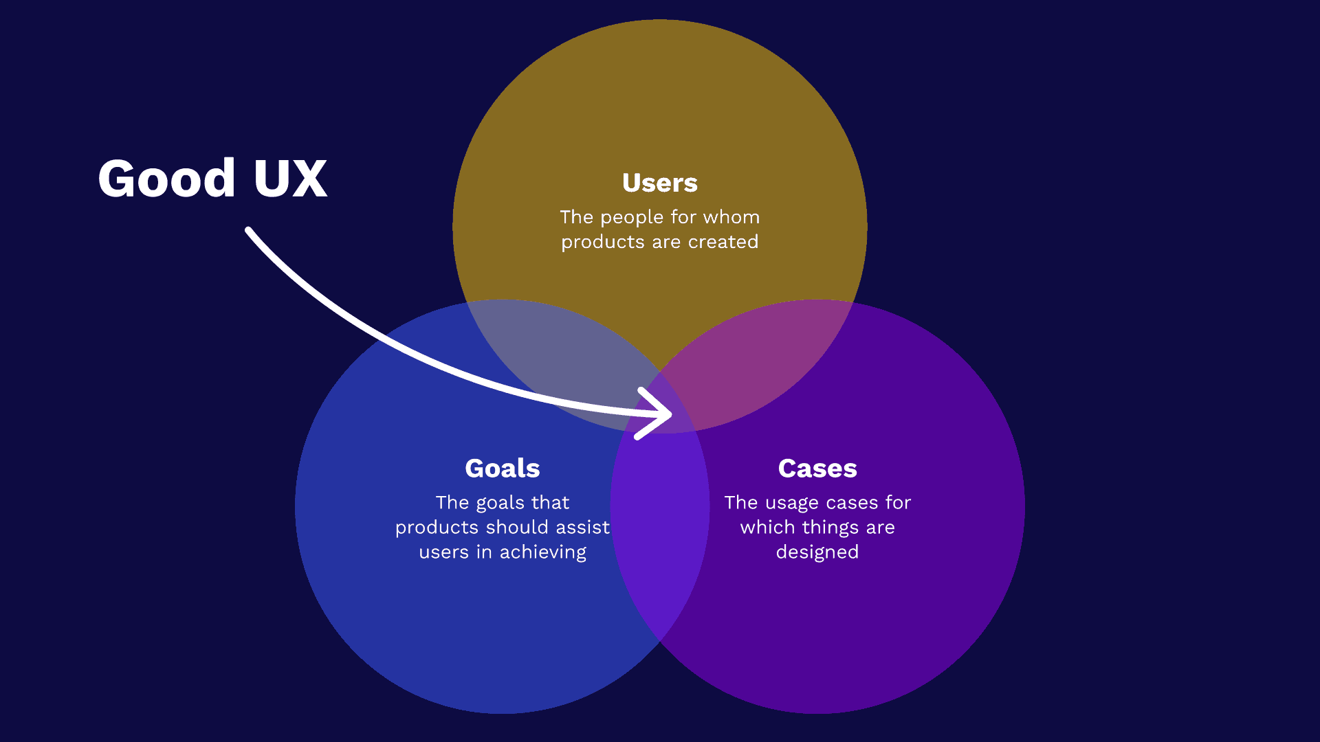
Caption: Good UX is an intersection of users, goals and cases.
Steve Krug, Usability Consultant and author of Don’t make me think: A common sense guide to web usability, outlines 7 key elements to understanding the principles of user experience. Sarah Abrehart of Focus7 makes the critical contribution of an 8th which helps to put user needs into an additional dimension of context:
- Useful – Does the product do something users need done?
- Learnable – Can users figure out how to use the product?
- Memorable – Do users have to relearn the product each time they use it?
- Effective – Does the product get the job done? Is it usable? Are patterns familiar and easy for users to understand?
- Efficient – Does the product get the job done with a reasonable amount of time and effort? Is content findable?
- Desirable – Do users want the product?
- Delightful – Is using the product enjoyable, or even fun?
- BONUS: Accessible – Is the digital product inclusive and available for everyone to use without discrimination? For a deeper dive on the importance of web accessibility see my definitive guide We need to talk about accessibility
Krug posits that: “usability is about people and how they understand and use things, not about technology” and only successful if “a person of average (or even below average) ability and experience can figure out how to use the thing to accomplish something without it being more trouble than it’s worth.”
See also: https://www.nngroup.com/articles/ten-usability-heuristics/
UX hierarchy of needs
A useful psychological model for developing a user-centred strategy is the UX Hierarchy of Needs, based on Abraham Maslow’s Hierarchy of Needs (adapted by Curtis Newbold from Stephen Anderson’s model).
Here the foundational task-oriented needs of a user (usually associated with product features) are represented by a wide base at the bottom, whilst more aspirational and experiential human needs (such as pleasure or personalisation) are at the apex of the pyramid.
The base three tiers focus on objective goals that can be measured with quantitative data. Meanwhile the upper three levels focus on subjective human experiences of a higher order which are measured by qualitative research.
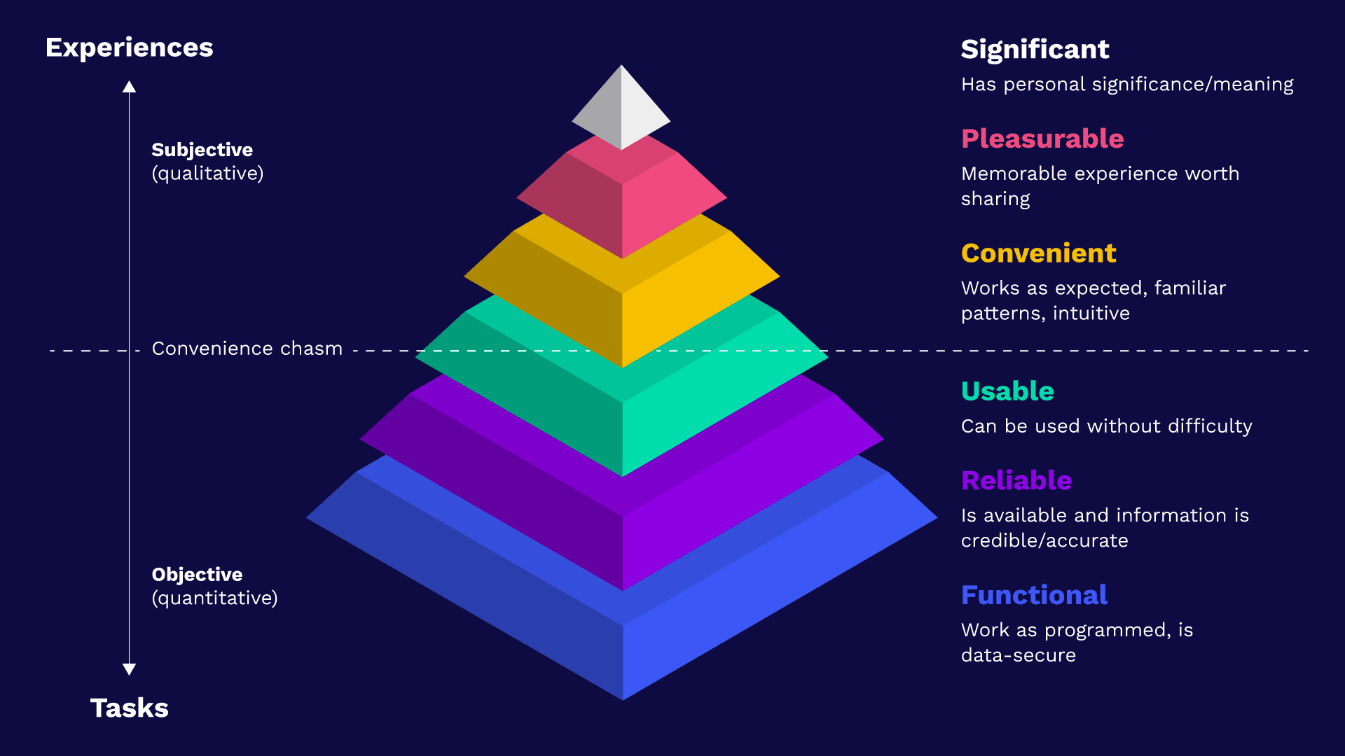
Caption: The UX Hierarchy of Needs.
This model proposes that organisations should build the foundational user needs into their digital products, starting from the bottom, before aiming to work towards the top of the pyramid – otherwise the result may be a product that looks great but fails to help users solve their problems. From the bottom up:
- Functional: works as programmed, is data-secure
- Reliable: is available and information is credible/accurate
- Usable: can be used without difficulty
- Convenient: works as expected, familiar patterns, intuitive
- Pleasurable: memorable experience worth sharing
- Significant: has personal significance/meaning
Many organisations fail to surpass what is known as the ‘convenience chasm’ and create products that meet basic user and business requirements but fail to give a pleasurable or personal experience.
Some fall even further below by failing to make their products accessible and therefore not fulfilling the basic foundational criteria.
Further reading
User psychology
User experience design is governed by a set of recognised laws and principles rooted in patterns of human behaviour and psychology. There are also commonly held mantras, misconceptions and myths-busting, all anchored in solid user research. Gaining insight into a users’ behaviour is part of the discipline of design psychology.
“By taking what the field of behavioral psychology has unearthed about the ways in which people typically respond to certain visual stimuli and applying it to visual design, UX designers can be hopeful of eliciting the desired outcomes.”

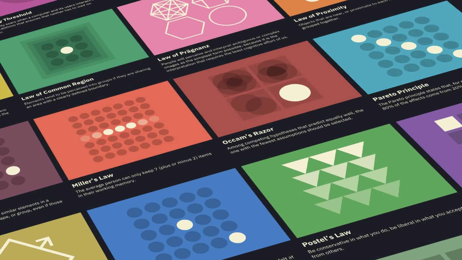
Caption: UX Laws by Jon Yablonski.
There are 4 key benefits to understanding these principles of design psychology:
- Creating designs based on human behaviour and satisfaction
- Improving analytical and research skills
- Formulate design solutions for common to complex problems
- Saving users time
Further reading
- Laws of UX
- growth.design
- UX Hints
- UX Myths
- A comprehensive (and honest) list of UX clichés
- NN Group Psychology Study Guide
- Built for Mars
What does good UX look like?
First, the bad
Sometimes it’s much easier to recognise or recall memories of a bad experience than it is those of a good one. According to the Peak-End Rule a user’s perception of an experience is heavily weighted based largely on how they felt at its most intense peaks or troughs and at its end, rather than the total sum or average of every moment in that experience.
We remember experiences in our lives as a series of snapshots rather than a complete catalogue of events. Our minds quickly average the moments that most stand out in our memories to form our opinion of the past. This memory bias means it can be easy to recall exceptionally bad experiences, for this reason one of the best ways to understand good UX is to see what terrible UX looks like and how frustrating it can be.
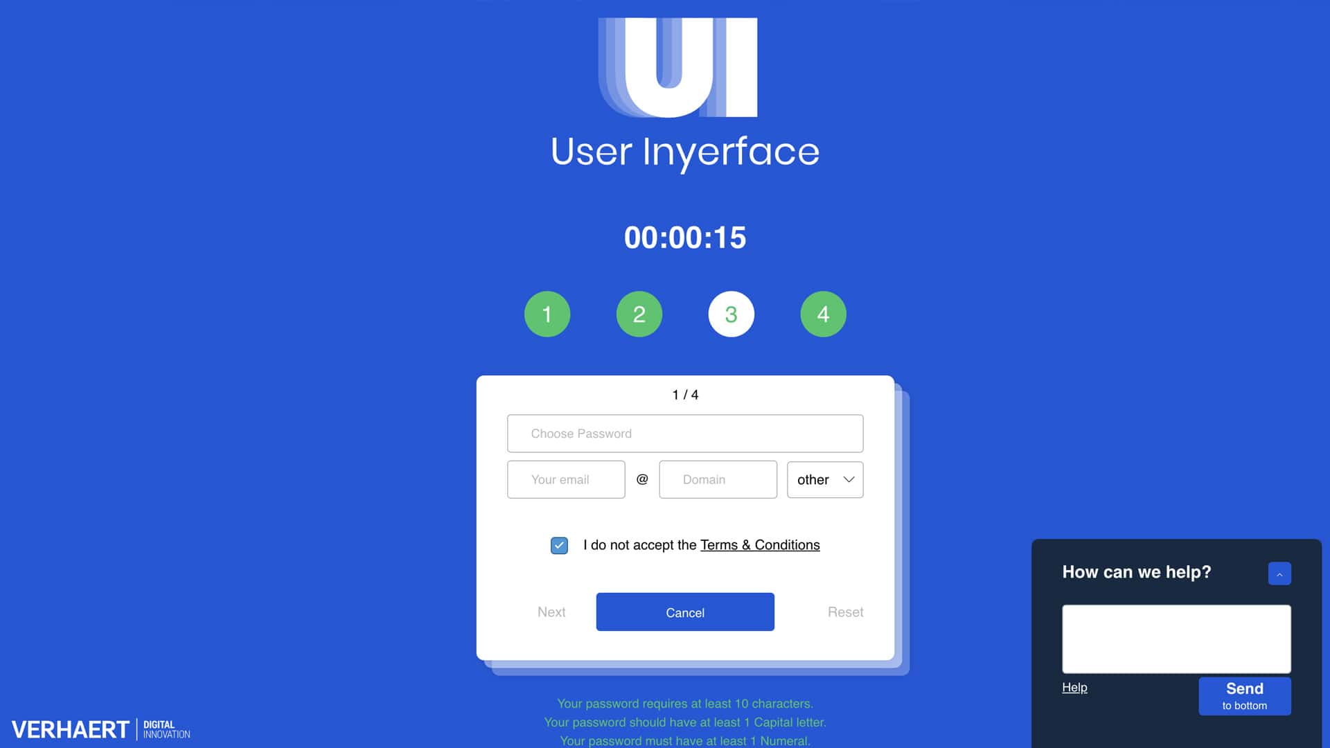
Caption: userinyerface.com.
Intersecting practices
There’s a vast intersection between UX, UI & accessible design best practice. On the subject of the latter: ensuring that a digital product is equitable and has fair access for all users is as much a matter of UX as it is accessibility.
There is a basic standard of usability, and the reduction of barriers to access, that need to be achieved (see the UX hierarchy of needs) before a product’s UX can be further focussed on its specific user demographic.
UX/UI design
In order to be most effective UX/UI Design needs to take into account all of the following, and more:
- Familiar patterns/components
- Best practice typography and content legibility
- Visual hierarchy, rhythm and layout
- Consistency & continuity
- Interaction feedback & states
- Best practice form design and validation
- Responsive, cross device/platform/browser design
- Navigable content
- Touch/cursor targets (see Ahmad Shadeed’s brilliant article on target sizes)
- Safe triangles
- Thumb zones
- Usability heuristics
- Colour use (60/30/10 rule) & contrast
- Scroll interactions
- Content
- Information scalability (0-1-2-1000-error)
Accessibility
In the UK alone Scope calculates there to be over 16 million disabled people, that’s approximately 1 in 4. That aside, this figure doesn’t take into account temporary or situational mismatched interactions between a person and their environment.
There is a direct correlation between targeting accessibility and improved general usability that benefits all users. Able users are increasingly likely to expect familiar patterns of functionality from a digital experience. Accessibility is about improving your website for everyone, not just a minority group.
“The global market of people with disabilities is over 1 billion people with a spending power of more than $6 trillion.”


We need to talk about accessibility
Whose responsibility is accessibility, how do you ensure your digital product is compliant and why does it matter?
This article explores key elements of creating accessible digital experiences, transcending barriers via a shared product vision and three-pronged approach that combines accessible design, technical web accessibility, and inclusive publishing.
“Solve for one, extend to many. Everyone has abilities and limits. Creating products for people with permanent disabilities creates results that benefit everyone.”

Site and page speed
In 2017 Google/SOASTA Research trained a deep neural network, a computer system modelled on the human brain and nervous system, with a large set of bounce and conversions data.
The neural net, which had a 90% prediction accuracy, found that as page load time goes from one second to 10 seconds, the probability of a mobile site visitor bouncing increases 123%.
Similarly, as the number of elements—text, titles, images—on a page goes from 400 to 6,000, the probability of conversion drops 95%. Thus proving that site and page speed have a fundamental impact on User Experience.
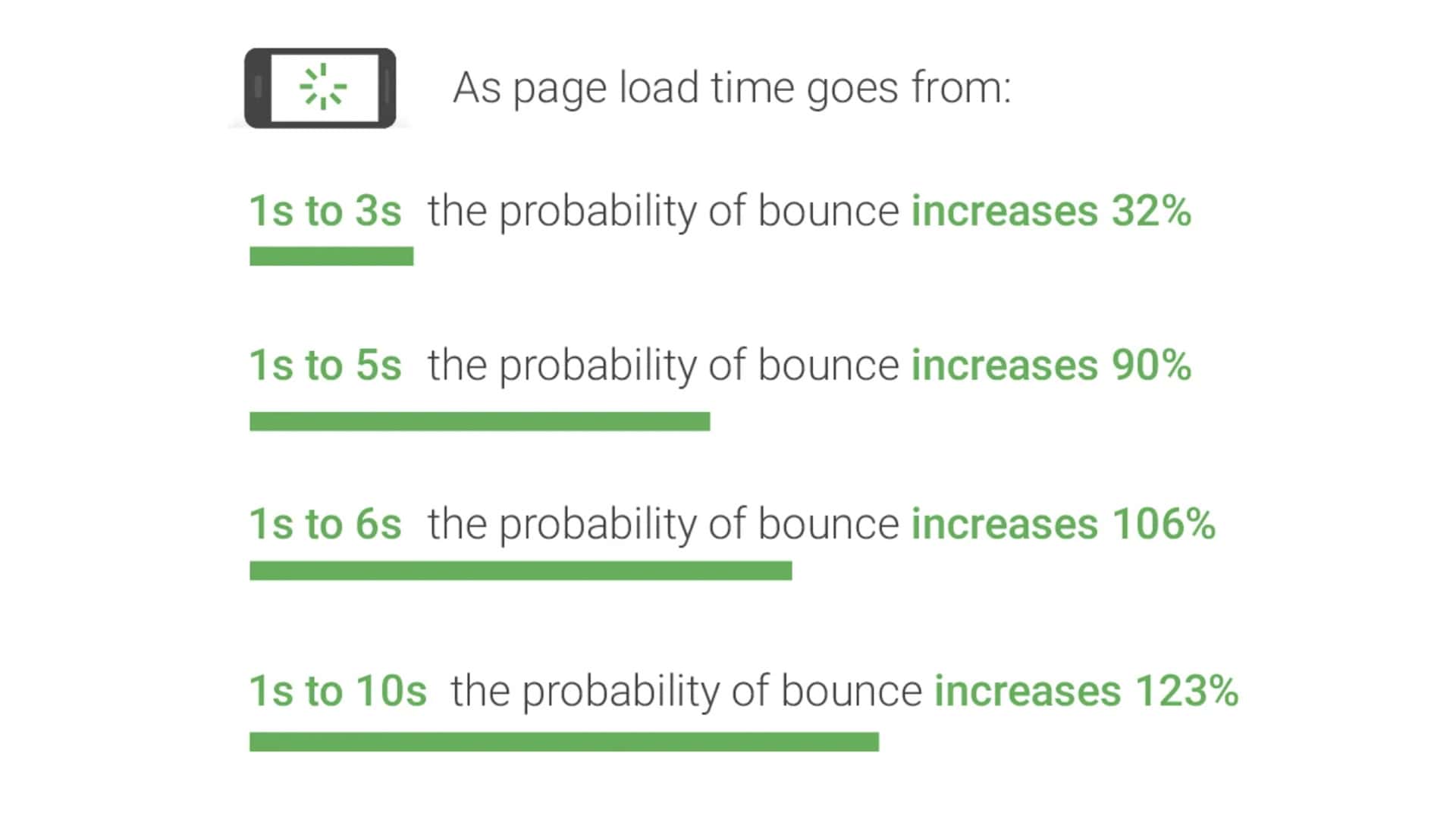
Caption: Google’s bounce probability statistics. As page load goes from:
- 1s – 3s the probability of bounce increase 32%
- 1s –5s the probability of bounce increases 90%
- 1s – 6s the probability of bounce increases 106%
- 1s – 10s the probability of bounce increases 123%
The 7 fundamentals of UX
The UX Design Institute asserts that there are 7 design principles fundamental to user experience, as follows:
- User-centric – User-centricity implies making informed decisions driven by a deep understanding of users, their problems and product expectations.
- Consistent – Consistency facilitates effortless navigation and predictability, reducing cognitive load and fostering a sense of familiarity and comfort for the user.
- Hierarchy – Visual hierarchy and Information Architecture directly impact how users interact with and interpret information.
- Context – Context refers to under which conditions a user interacts with a digital product, the user’s environment, physical and emotional states, and potential interruptions are important.
- User control – User control asserts that users should be able to control their experience, navigate seamlessly, and utilise advanced functionalities according to their comfort level.
- Accessibility – Ensuring that the digital product is equitable and inclusive to all users, regardless of their abilities.
- Usability – The ease with which users can interact with a product or service to achieve their goals.
A user-centred process
Putting your users first ultimately amounts to taking the time to consult with and listen to them. The best way to find out what users need from your product is to ask them. User Experience is all about understanding the needs of the people using your digital product and solving their problems.
Dmitri Atrash offers these simple pointers for delivering quality UX:
- Your customers are not all experts in your field. Be open to their input and blend it with what you know works.
- Users won’t always know what they want. Rely on your expertise and that of others.
- Designing for emotion drives behaviour. Ground your work in tested and established principles.
- Keep it simple. Generally, people are lazy and want everything to be easy.
A user centred design process should incorporate many of the below working methods.
Research methods
Project processes aren’t necessarily always linear in nature and in fact UX improvement can often benefit from an agile approach. It’s important to learn, test, measure and iterate.
UX Designers have a multitude of tools, processes and research methods at their disposal. Nearly all projects would benefit from combinations of these practices carefully selected depending on organisational challenges or objectives.
It can be helpful to begin with a hypothesis based on observation or qualitative research and then to use quantitative data to validate the theory. Nielsen Norman Group provide an excellent 3-dimensional framework for plotting some of the most commonly used methodologies on the following axes:
- Attitudinal vs. Behavioral
- Qualitative vs. Quantitative
- Context of use
Methods we commonly used to evaluate the quality of UX include:
- A/B testing
- Remote unmoderated user testing
- On/off-site surveys and user feedback (Net Promoter Score, Customer Satisfaction, CX Index)
- Heatmaps, session recordings and user observations
- Scroll and click tracking
- On-site search query analysis
- User interviews & research
- Data insight from analytics: looking at funnels, exit pages, path explorations, retention, bounce rates, acquisition, abandonment, session dwell, page views, Conversion/Task Success Rates and more!
- Cross device, browser and platform testing
- Conversion, checkout and form optimisation (forms are notoriously a friction point for users as they require high levels of cognitive effort and user input)
- Form abandonment tracking
- Site speed & Core Web Vitals (see Site and page speed)
- Business knowledge and that from Customer Service/Support Teams
- Competitor/contender analysis
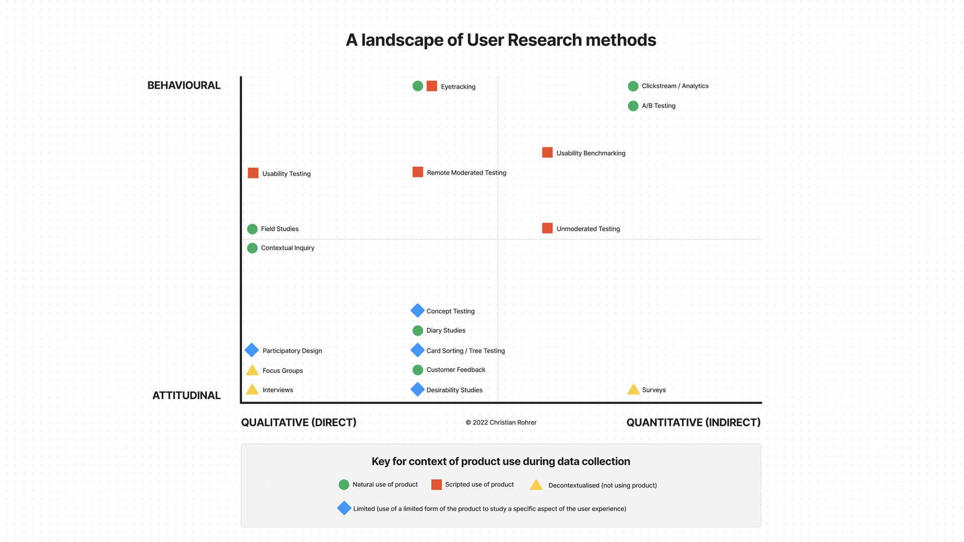
Caption: When to use which user testing research methods, by Christian Rohrer
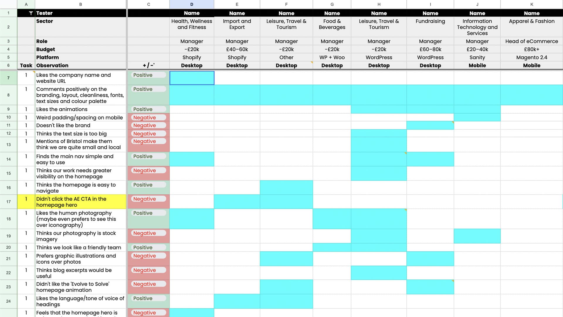
Caption: A spreadsheet of user testing analysis, by Matt D Woodman.
User flow
A user flow is a visual representation of the typical, expected or desired avenues that users may take when navigating a digital product. These often take the form of simple flow chart diagrams.
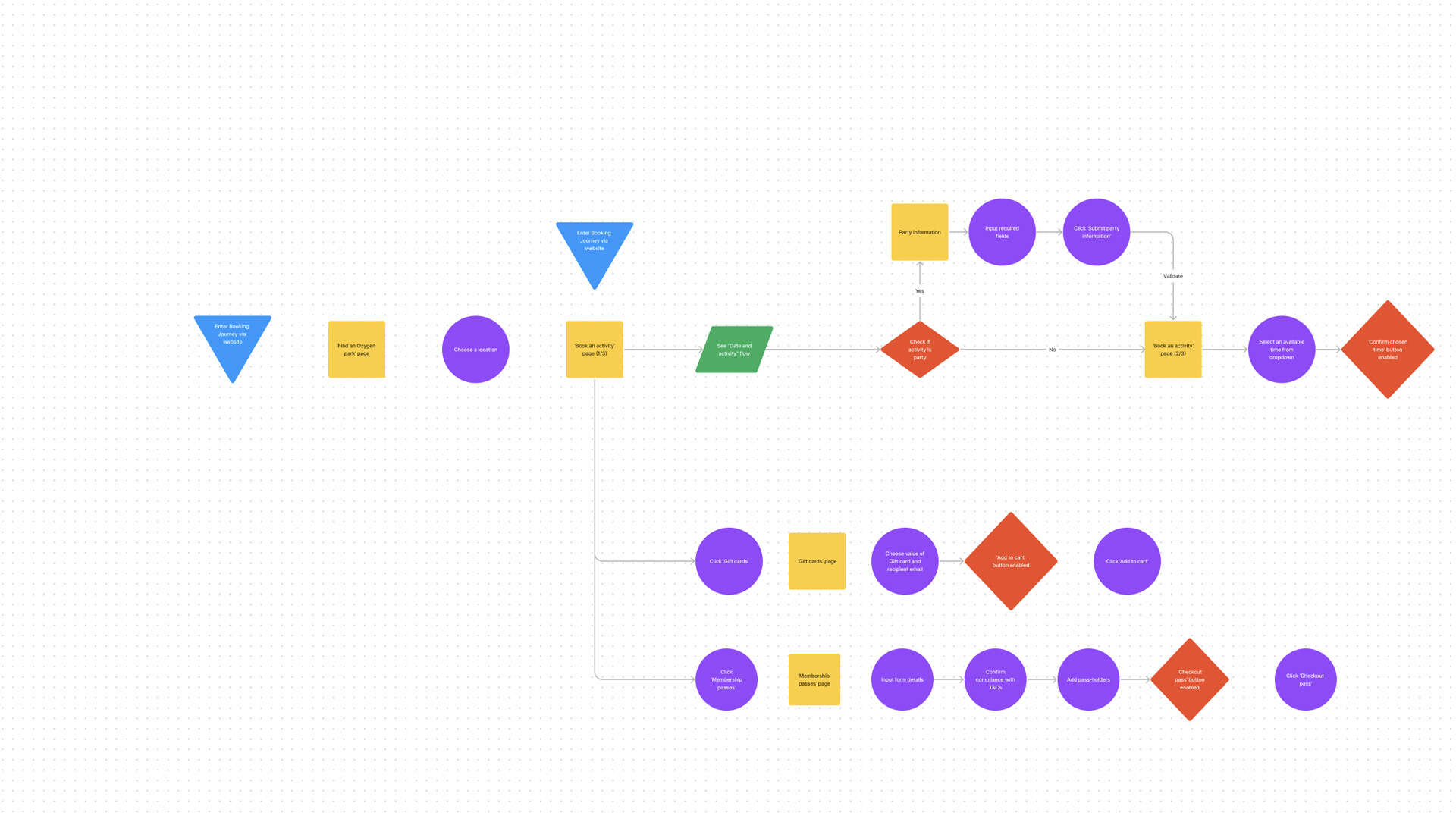
Caption: An example user flow diagram, by Matt D Woodman.
Empathy map
Empathy maps help us to empathise with and understand our users by asking:
- Who are we empathising with?
- What do they need to do?
- What do they hear, do, say and see?
- What do they think and feel?
- What are their pains and hopes?
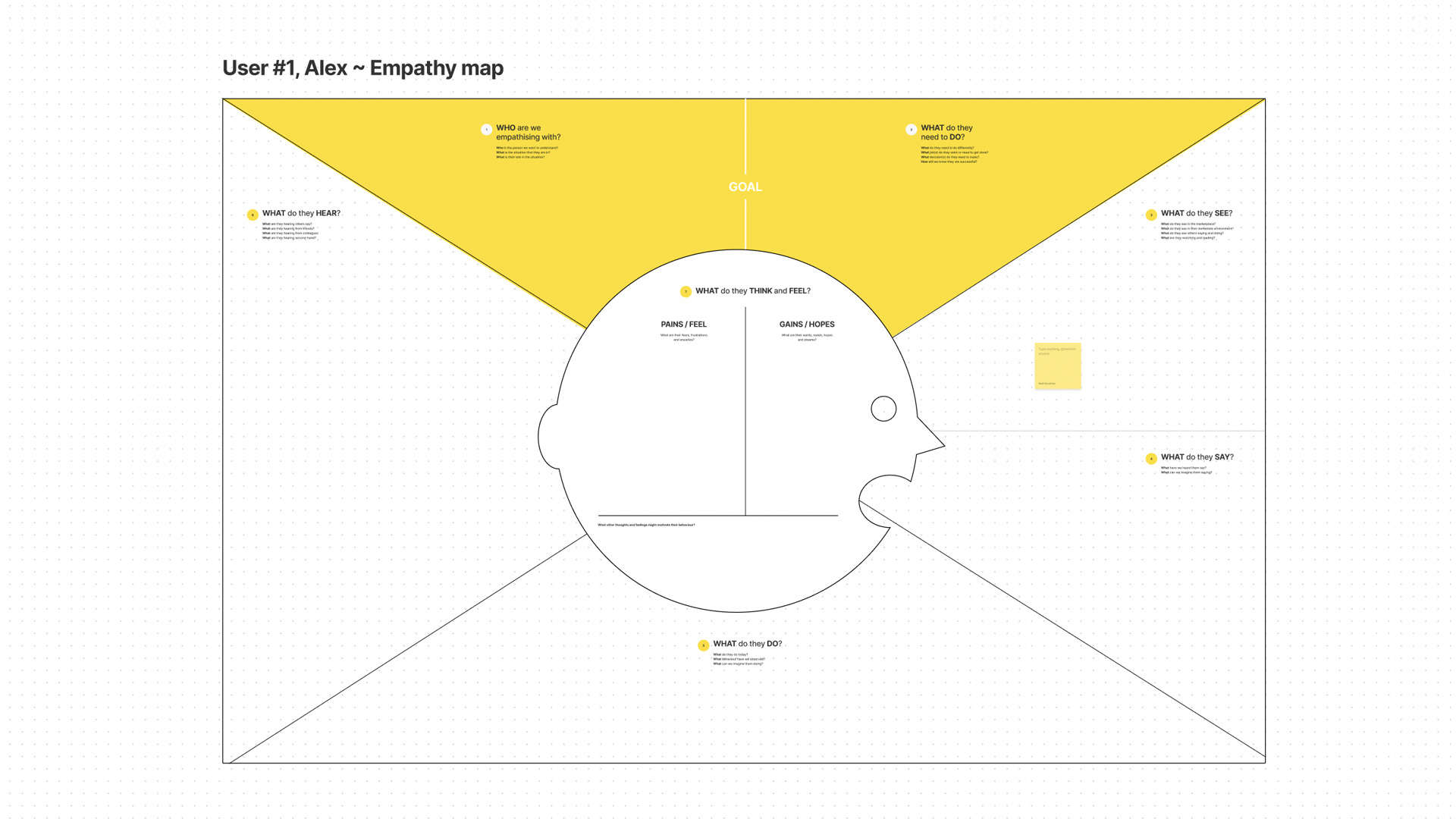
Caption: An empathy map template, by Matt D Woodman.
User persona
The primary objective of establishing user personas is to provide a reference to guide all decision making. Personas provide clarity and direction allowing you to validate and evaluate tasks by always considering the end target user. User personas should always be generated using insights from data and not speculative or based on assumptions.
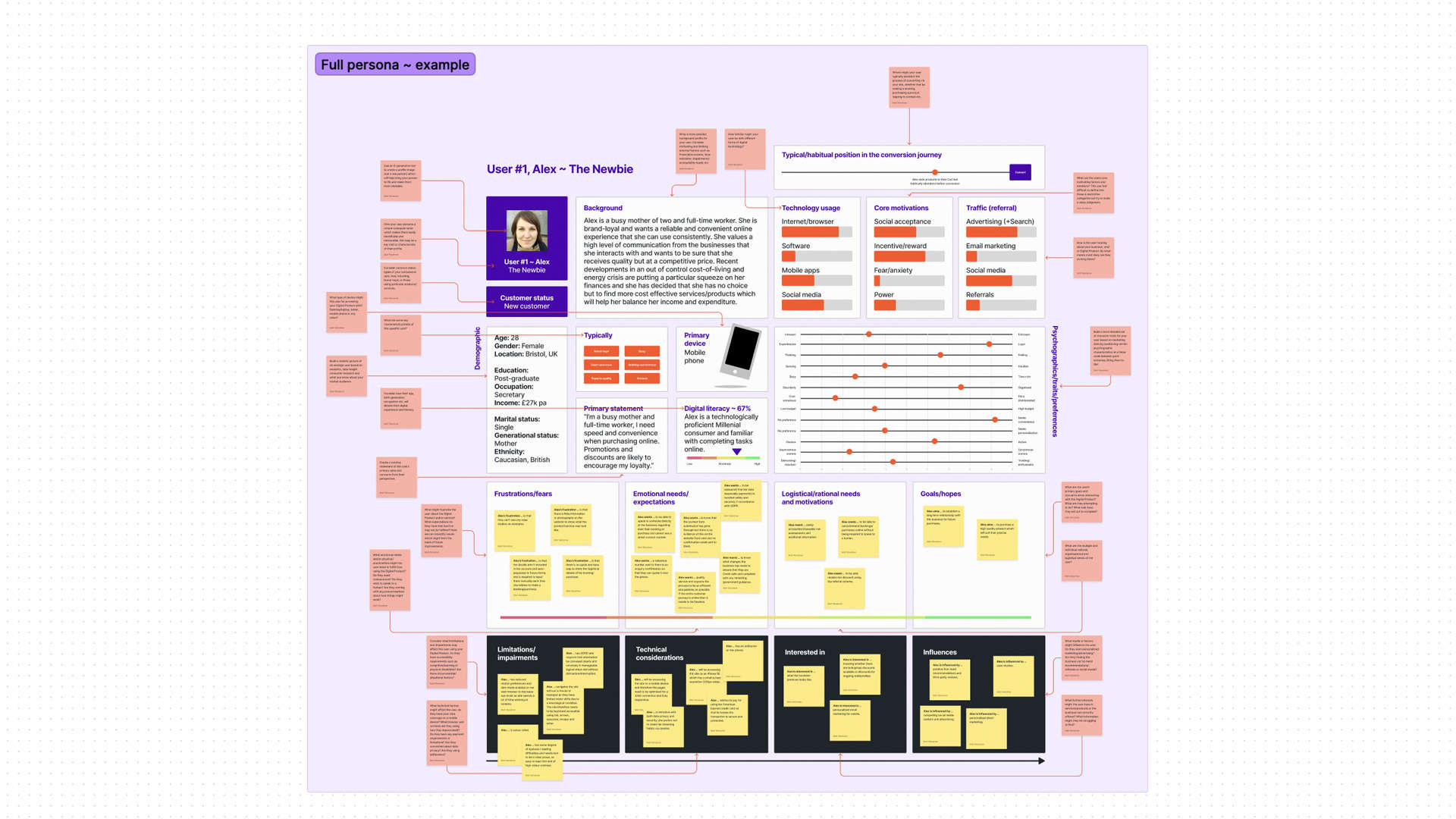
Caption: A user persona template, by Matt D Woodman.
Sitemap (information architecture)
A Sitemap is a plan of the front-end website structure, and how content is inter-connected, which allows planning of the information architecture (and configuration of a CMS, if there is one). This includes organising, structuring and labelling which can aid content planning.
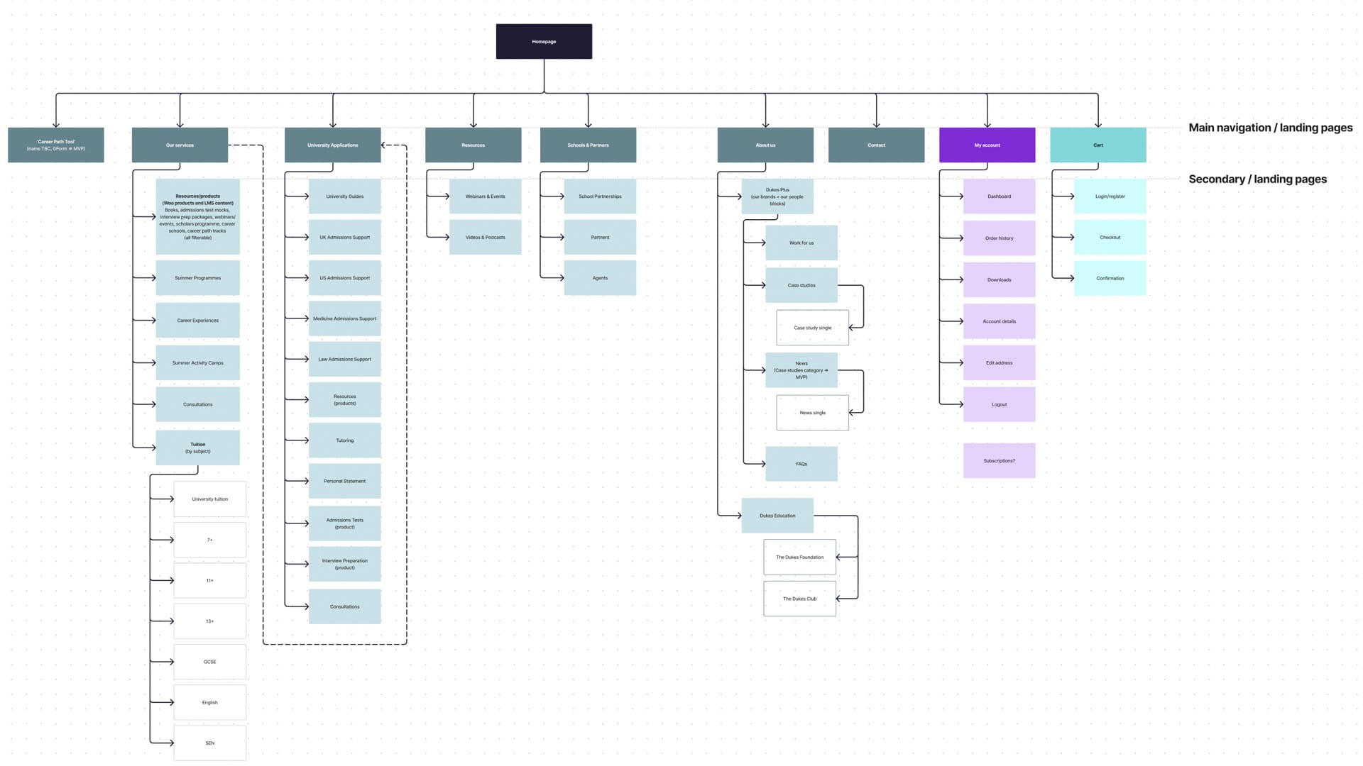
Caption: A sitemap diagram, by Matt D Woodman.
Wireframe
A Wireframe is a visual guide that represents the skeletal framework of a website and the user experience. Wireframes can be low or high fidelity in detail and showcase some user interactions if prototyped. Wireframes are often tested with users to validate hypotheses about a website’s design.
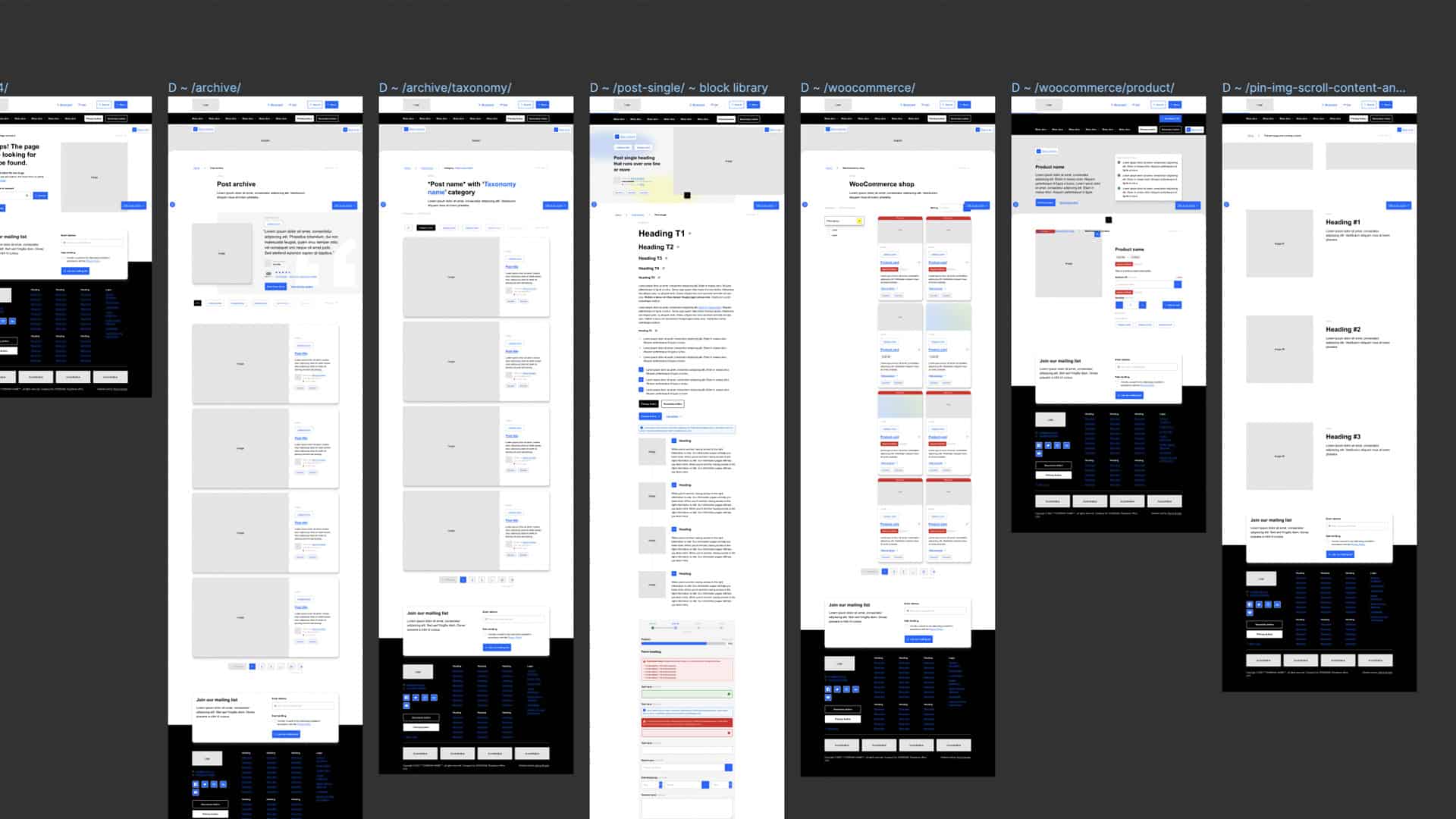
Caption: Figma wireframe boilerplate, by Matt D Woodman.
Prototype
Prototypes provide a demonstration of how an interactive application may function. These may be used in later stages of the project as proof of cconcept and to showcase interaction feedback and states.
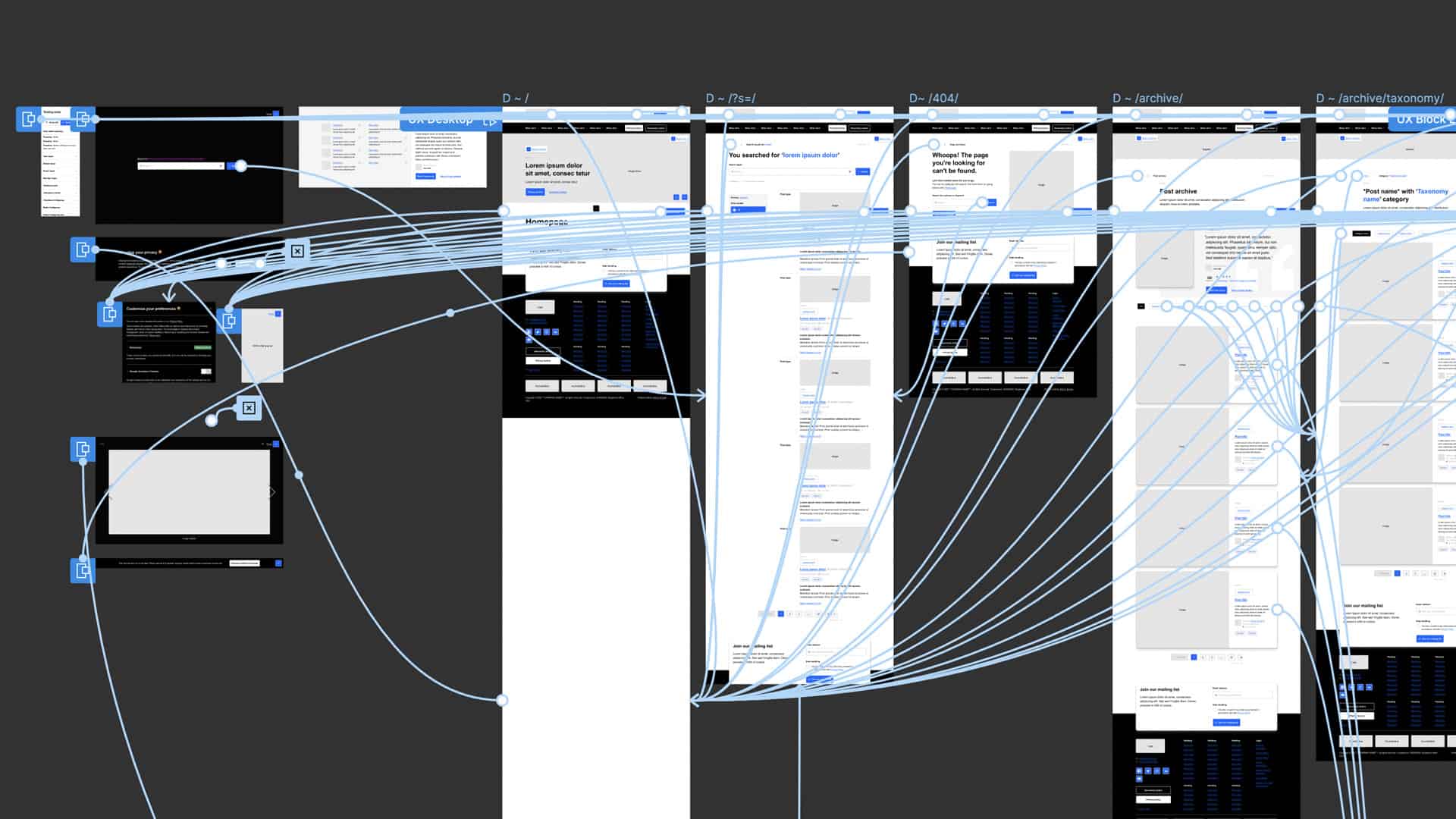
Caption: Figma boilerplate prototype, by Matt D Woodman.