Type
Proofer
#graphicdesign, #bristol, #uwe, #student, #mdwoodman, #woodman, #matt, #mattdwoodman, #design, #typography, #typographer, #custom, #lettering, #bespoke, #typeface, #type, #typedesign, #designer, #graphics, #blackhole, #black, #hole, #singularity, #point, #pt, #gravitational, #gravitationalsingularity, #singularitypoint, #singularitypt, #instance, #interpolation, #interpolate, #multiplemaster, #multiple, #master, #geometric, #optical, #axis, #opticalaxis, #opticallyresponsive, #responsive, #extendedtext, #body, #copy, #text, #display, #typesetting, #letterform, #glyph, #dynamic, #dynamically, #real, #time, #realtime, #user, #interaction, #userinteraction, #automated, #automatic, #automatically, #outline, #variation, #nominal, #typesize, #scale, #size, #character, #axes, #modify, #contours, #parameters, #weight, #width, #coordinate, #original, #unique, #concept, #revolutionary, #automated, #commercial, #pioneering, #experiment, #experimental, #project, #universe, #stellarcollapse, #collapse, #stellar, #light, #matter, #density, #dark, #void, #cosmic, #cosmicvoid, #infinite, #infinitedensity, #science, #scientificlaw, #theory, #theoretical, #space, #time, #spacetime, #gravity, #mathematically, #mass, #curvature, #crushed, #infinitesimally, #pull, #intense, #law, #physics, #lawsofphysics, #theoretically, #conceptually, #process, #reality, #consumption, #scale, #proportion, #distorted, #condensed, #disseminated, #interactive, #framework, #applications, #adobe, #indesign, #adobeindesign, #adaptive, #paradox, #paradoxical, #spaghettification, #spaghettified, #astrophysical, #spaceregion, #contraction, #dense, #trap, #inktrap, #collapsing, #inward, #intensity, #destructive, #consuming, #font, #postscript, #opticalsize, #fontlab, #fontographer, #transtype, #response, #input, #engagement, #pst1, #independent, #geometry, #unity, #inter-glyph, #relationship, #sans, #sansserif, #tone, #balance, #elementary, #shape, #consistent, #linear, #paths, #stem, #equal, #adapting, #stability, #unity, #symmetry, #juxtapose, #metaphor, #futura, #futurism, #technology, #science, #modernism, #progressivism, #industrialism, #astrophysical, #adaptation, #counterform, #extreme, #circle, #star, #mm, #win, #mac, #type1, #opentype, #otf, #ttf, #metrics, #kerning, #analogue, #proofer, #tester, #typetester, #developed, #developer, #website, #digital, #print, #specimen, #site, #built, #adaptable, #increment, #variant, #ui
Info
Singularity Pt is a geometric optically responsive Multiple Master typeface design for extended text and display use. Letterform designs respond dynamically, in real time, to user interaction automatically adjusting glyph outlines at varying nominal sizes between 6 and 72 point. Scaling of the characters along an optical axis forces the typeface to modify its contours on three individual parameters — the weight, width and severity of contracting coordinates.
An original typographic concept, based on the gravitational singularity — or black hole — Singularity Pt is a unique and revolutionary first in bringing adaptive and automated typography, with significant capacity for potential future applications, to a commercial platform. Such a pioneering and experimental concept has never before been launched as a viable typographic solution.
Designed by Matt D Woodman, Singularity Pt is now available on release as a commercial typographic project.
Gravitational Singularity
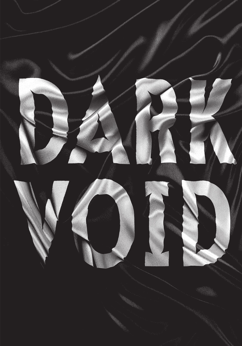
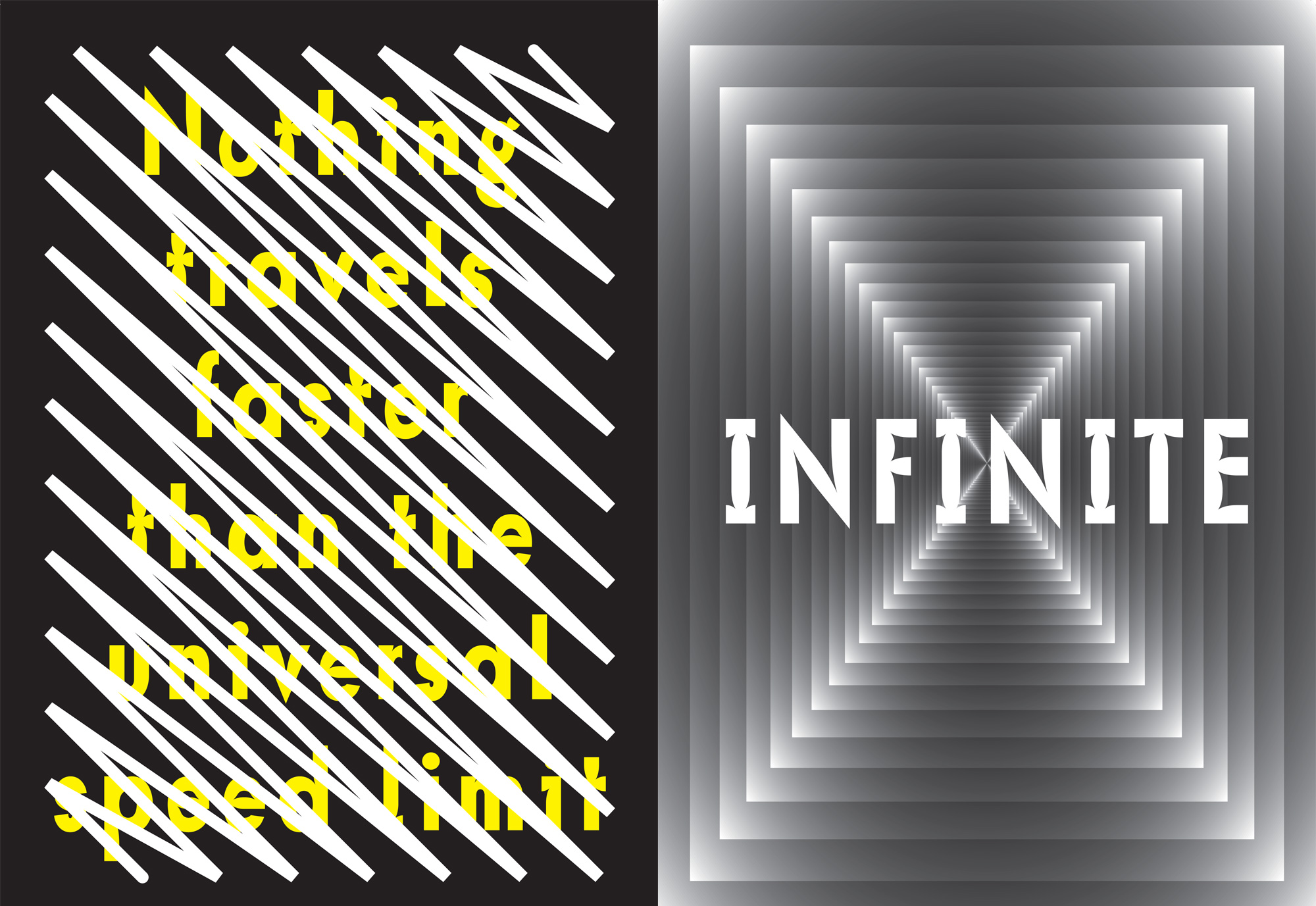
A point of singularity, borne unto the universe in a transient moment of stellar collapse. No light, nor matter, can escape the majesty of this dark and mysterious cosmic void. These entities of infinite density defy the comprehension of human thought and scientific law. The black hole is an enigma of space and time.
A gravitational singularity, or spacetime singularity, is a term used to describe the centre of a black hole, where gravity is thought to be mathematically infinite. A singularity should be envisioned as an inconceivable point of zero mass and infinite density of matter. At the center of a singularity spacetime has infinite curvature and matter is crushed to an infinitesimally small scale under the pull of intense gravity. Space and time cease to exist and the laws of physics become theoretically irrelevant.
The theoretical concept of a gravitational singularity is largely incomprehensible on a practical level and can only truly be explained mathematically. Attempting to envisage a region in space of zero mass, intense gravitational force and infinite density, where neither time nor space have any relevance, is intractable by process of thought.
For this reason, when attempting to create a typeface which conceptually encapsulates such a subject matter, it was important to identify practical points of reference and common themes which could then inform the design process. The analysis of those elements integral to the concept was carried out from a number of perspectives.
Frame of Reference
Firstly, establishing practical points of reference in the context of observable reality, looking at instances of consumption and density in fabric of the everyday in order to make the subject more relatable. Secondly, investigation of visual representations of the black hole, studying currently accepted diagrammatic cues, with the goal of attaining a more considered understanding of how a wholly theoretical concept might be illustrated.
Initial research proved that notions of scale, proportion and density were integral to the current theoretical understanding of gravitational singularities. Explicitly demonstrating that matter becomes distorted, condensed and disseminated as it enters a singularity point became a fundamental objective of designing the typeface.
Illustration of such an idea could potentially be acheived in one of two ways — by using interactive features to demonstrate the typeface’s conceptual framework or simply doing this through its design and aesthetic form. The notion of conceiving a typeface with applications extending beyond routine typesetting capabilities and into real-time responsive typography, within parameters enforced by a user, was an original and thought provoking challenge.
Such interactive parameters could potentially serve to richen the user experience demonstrate a more comprehensible creative abstraction of a complex scientific theory. Ultimately the visual presentation, construction or interactivity of the typeface was required to be a considered creative expression and interpretation of the gravitational singularity.

Design Concept
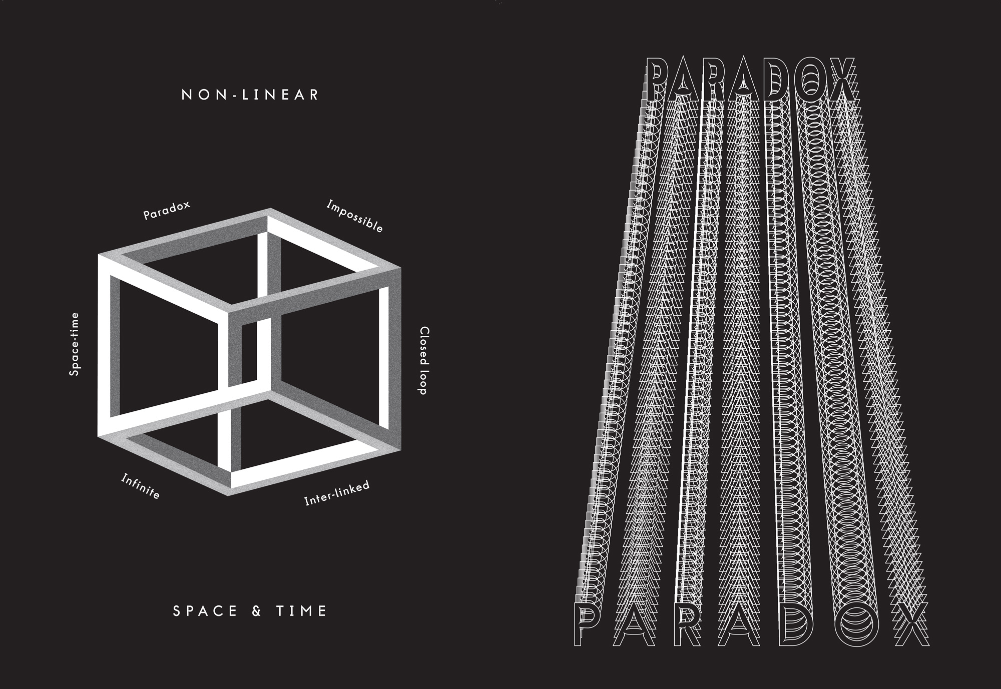
The adaptive nature of the type contours makes conceptual reference to the project inspiration and namesake, the singularity point. This paradoxical astrophysical entity of infinite density and zero volume, an intractable region of space, is inferred by the changing values of the typeface design.
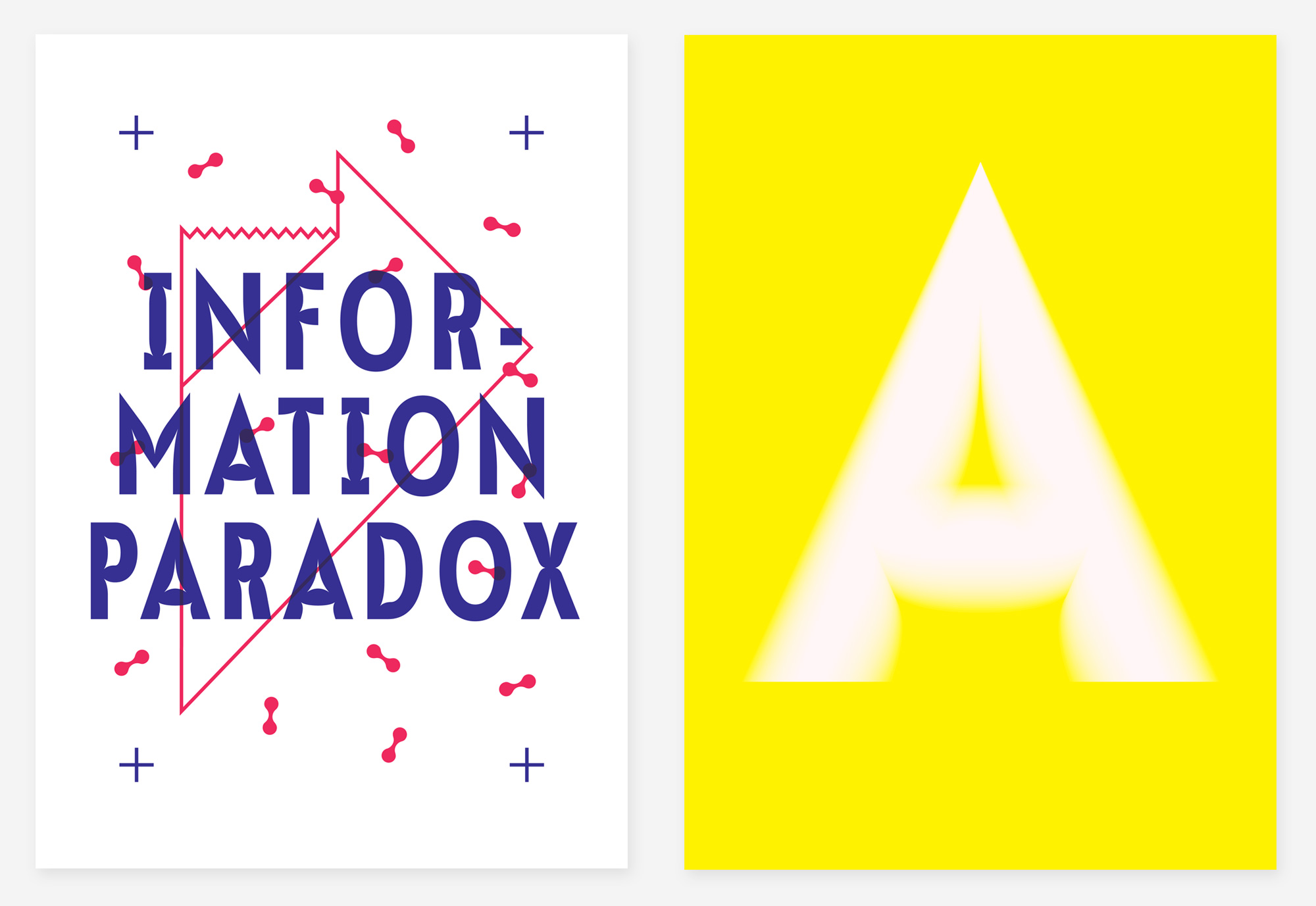
As the nominal point size increases the stem strokes become heavier, drawing parallels with the density of the black hole. Equally the letterforms become more condensed, making reference both to the infinitesimally small nature of the singularity, and to its increasing contraction to an inconceivably dense point under intense gravity.
Similarly the violently contracting ink traps, inwardly collapsing with increased intensity, as the nominal point size of the typeface is raised, serve to strengthen the underlying concept of the typeface design. These anchored coordinates create more and more distortion to the letterform, thereby rendering glyphs less legibile. Whilst simultaneously making subtle reference to the destructive and enigmatic nature of the black hole, swallowing and consuming all thats stands in its path.
Multiple Master
Multiple master fonts are Adobe PostScript Type1 (PST1) font programs that include two or more ‘masters’ contained within a single font file. This file extension typically carries a minimum of two or more masters situated on ‘axes’, or interpolation dimensions (up to four can be implemented), which might represent extreme variations in the font weight, width, style or optical size.
Supporting type design software is then able to blend the multiple master outline variations via an automated process, calculating differences and interpolating countless consecutive ‘instances’ between the original files. These generated instances are then available to be exported, by the type designer, as individual font files for use in desktop publishing software. Commonly used by type designers this file format provides the type designer the ability to generate large quantities of variations from a single font file, as the basis for large typeface families, providing unprecendented typographic flexibility.
Alternatively, however, these PST1 font files can be deployed into specific desktop publishing applications, though unfortunately the support is fairly limited. Multiple Master files may be placed within a specific path directory of the application Adobe InDesign, in order that the software be able to produce interpolations on the fly, along a multiple master axis, in response to selected user input and engagement.
This method of MM implementation is backwards compatible from Adobe CC back to InDesign 2.0, but strictly limited only to Adobe InDesign. InDesign also allows preferences, specifically in relation to variations on the optical axis, to automate the process of instance selection, essentially creating an interactive typeface. For the most part, with the exception of type design software, the Multiple Master file format is now largely unsupported and outdated.
Research has revealed that the production of Multiple Master fonts, based on optical axes and released commercially, has not been done since the early nineties, and only ever by Adobe, at an extremely high margin of cost, never notably by an independent type designer. In addition to this the majority of those files sold and distributed are rare or no longer in circulation.
Therefore, such an automated digital typographic design is an extreme rarity, if not a revolutionary first, in utilising Multiple Master technology for a commercially viable experimental project. This in turn means that this optically altering dynamic type design, produced as a viable typographic solution for a creative market, is totally unique.

Geometrics
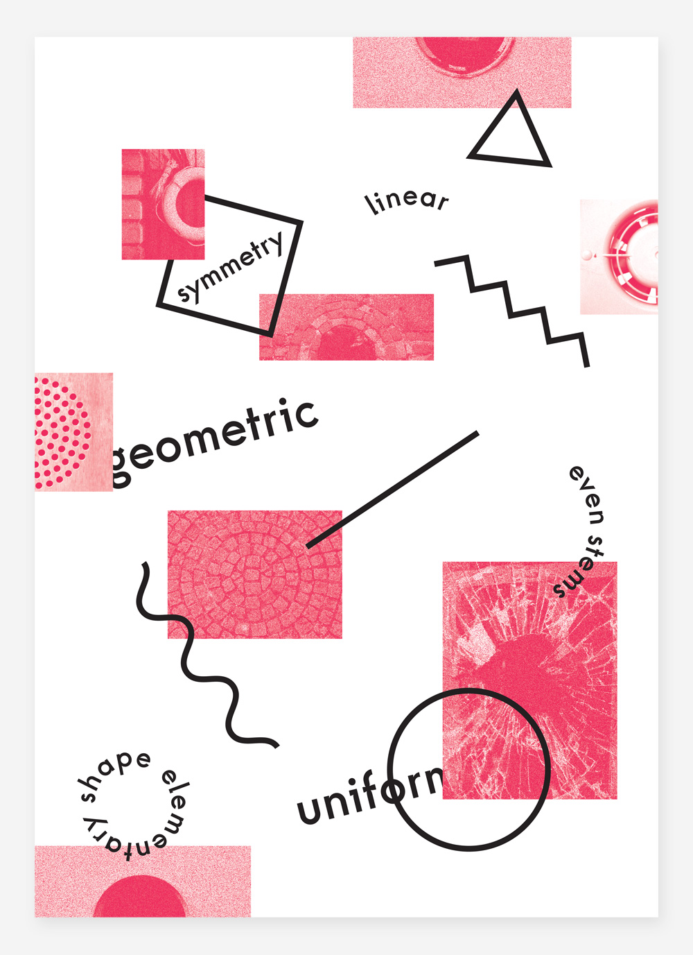
The even and uniform geometric contours of Singularity Pt, owing much of their unity to intricately measured inter-glyph relationships in height, width, the alignment of appendages and angles of trimmed stems, have taken heavy inspiration from a number of other commercial, and in most cases geometric, sans serif typefaces. In some cases the appearance and styling of individual glyphs has been directly informed by other letterforms, in others it is the tone and balance across the typeface as a whole.
Each letterform's geometry is based in its entirety on as basic an elementary shape as possible, and it is the consistent relationship between these glyph shapes that has become a defining feature instilling a more complete character and tone across the typeface. The absolute linear paths, precisely measured consistently equal stem width and light tapering of the lowercase characters standing in stark contrast to the typeface's adapting optical qualities and violently contracting ink traps. The stability, unity and symmetry of the outlines juxtaposing against the chaotic nature of the project's conceptual foundations.
Sans serif geometric tyepfaces such as — Paul Renner's Futura, Brandon Grotesque by Hannes von Dohren, Monokrom's Telefon and House Industries' Neutraface — with their imposed but inherent connotations of futurism, technology, science, modernism, progressivism, industrialism and the astrophysical were integral to informing the initial design of Singularity Pt. Later designs such as Studio Julia's Elephant and Matthew Carter's Bell Centennial were influential in providing case studies for the adaptation of glyph ink traps, counterforms and extremes.
Of particular intrinsic value to the concept and visual presentation of Singularity Pt is the basic circle. Posing as a rudimentary metaphor, and also being the commonly acepted visual adage denoting the appearance of a black hole, this shape is repeated consistently throughout the design. Acting as the basis for many glyphs the exacting angles of a perfect circle have been used to craft the contours and curves of every non-linear character.
Commercial Availability
Singularity Pt is available for commercial release. If interested in purchasing a license, for enquiries regarding commercial usage, general interest or more information please direct all queries to Matt D Woodman using the contact details provided.
Type files can be delivered in a number of formats for print output. For use of the automated optically responsive axis in print, strictly only compatible with Adobe InDesign (back compatible to 2.0), both Win MM PostScript (.pfb) and MAC OS X MM PostScript Type 1 (PST1) outline font files are provided. For other print applications any interpolated instances including and between 6 and 72pt optical variants can be provided in OpenType (.otf) format.
TrueType (.ttf) file format is also available for screen use, though the font features no hinting for screen resolution and display. All letterforms are based on analogue hand-drawn sketches, bespoke metrics and kerning have been created manually by optical adjustments.
Singularity Pt is an original typographic design concept based on the gravitational singularity. Typeface and all digital/print specimens designed by Matt D Woodman. Bespoke digital site designed, developed and built by Matt D Woodman.
All images, intellectual property & design © Matt D Woodman MMXIV — All rights reserved. Made in Bristol.
Video
Inspector
